Re-designing a Human-AI Collaborative System to Assist Pathologists
MitFlex is an artificial intelligence- (AI) aided navigation system that assists pathologists with mitosis identification when looking at whole-slide images. During Winter 2024, I joined UCLA HCI Research’s ongoing project under the guidance of Ph.D. student Hongyan Gu and Dr. Xiang ‘Anthony’ Chen and re-designed the existing system used by pathologists.
Timeline
Jan 2024 - Apr 2024
My Role
UX Designer
My Contributions
Created the user flow chart
Designed low- and high- fidelity prototypes
Added the annotation features (i.e., comments, uncertainty labels, flags), additional settings, & 2nd mini-map
Made adjustments to existing user interface
Team
1 Principal Investigator, 1 Project Lead / Mentor, 1 UX Designer, 2 Developers
Tools & Methods
Figma, Google Suite, User Research, UX Design, Wireframing, Agile Methodology
PROBLEM
Assessing mitoses from pathology scans is complicated.
While recent advancements in AI in assisting histological examination have been made, there is a lack of overall quality control in the outcome of AI-assisted diagnosis.
SOLUTION OVERVIEW
Remote collaboration via annotations for better accuracy
MitFlex enables pathologists to collaborate remotely with the assistance of AI. The newly re-designed system allows a second pathologist to oversee the first pathologist’s annotations and comments, which allows room for refinement of results based on their judgment.
Uncertainty Markings
Identify mitoses
Label mitoses that user is unsure of
Comments
Leave comments on specific areas
Flags
Flag areas that need to be reviewed
DISCOVER
Understanding the current system and its users
Since I onboarded an ongoing project, I had to quickly grasp an understanding of the current system that pathologists were using, the goal of the project, and the challenges faced by the users. I read 2 research papers that addressed prior systems and changes that have been made: “Augmenting Pathologists with NaviPath: Design and Evaluation of a Human-AI Collaborative Navigation System” (2023) and “A Human-AI Collaborative System to Support Mitosis Assessment in Pathology” (2018). Reading these papers also allowed me to empathize with the users.
Intended users:
pathologists who examine the pathological pattern of mitosis.
Pain points:
Users found it complex and difficult to assess mitosis from pathology scans.
Pathologists’ navigation of pathology scans is complicated due to the small size of mitosis, its low prevalence rate, and heterogenous distribution.
These challenges have resulted in low reported sensitivities, consistencies, and efficiencies among pathologists in previous works, which can negatively impact medical outcomes.
Main features of current system:
Uses a depth-first-search algorithm to calculate regions of interests (ROIs) with the flexible morphology, which can include the highest # of AI-detected mitotic events
Offers enhanced explainable AI (i.e., saliency maps, trust scores, subclasses, etc.) to assist pathologists in making a judgment
DEFINE
I was given the task of redesigning MitFlex to enable collaboration and better assist pathologists overall. More specifically, I was told to maintain a similar layout and information provided by the current system, but add new features that allow a user to comment and leave uncertainty markings for the next user view. For winter quarter, I was assigned to work on the interface of the first user’s point of view.
How do we improve the accuracy of AI-assisted mitoses identification?
Limitations
Since there was limited time for developers to code a new system with complex features, I was asked to make simple changes that the developers would be able to easily implement.
IDEATION
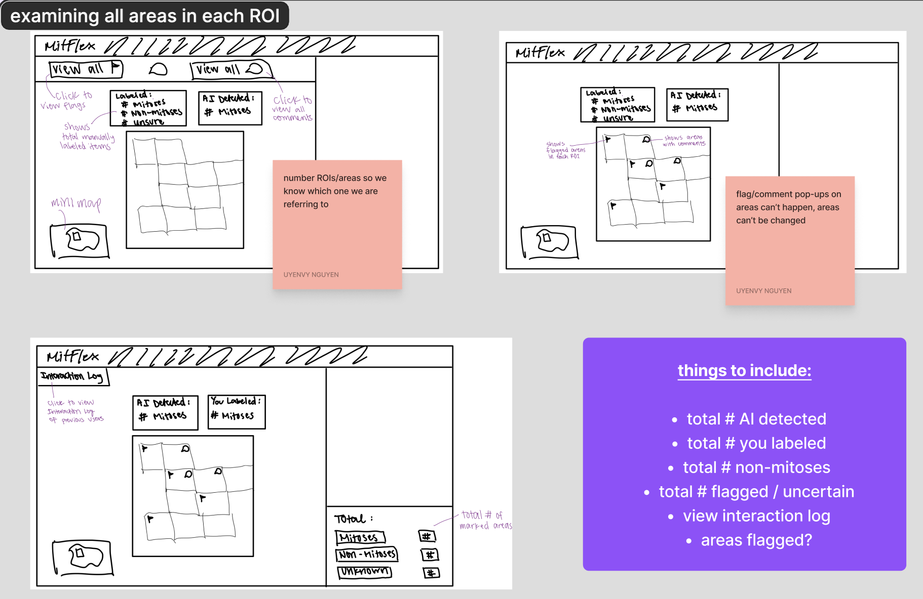
After a couple of meetings with my mentor and gathering the information that he wanted to be included in the new design, I created wireframes of potential screens.
Brainstorming potential designs
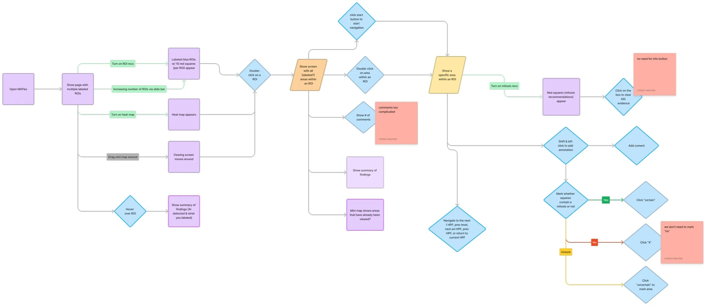
Visualizing the user journey
I created a user flow chart to better visualize the steps that the user would take after opening MitFlex, as well as the various screens and their associated features. I also added some notes after receiving feedback from my project lead regarding the added features.
DESIGN
Iterating, iterating, and more iterating!
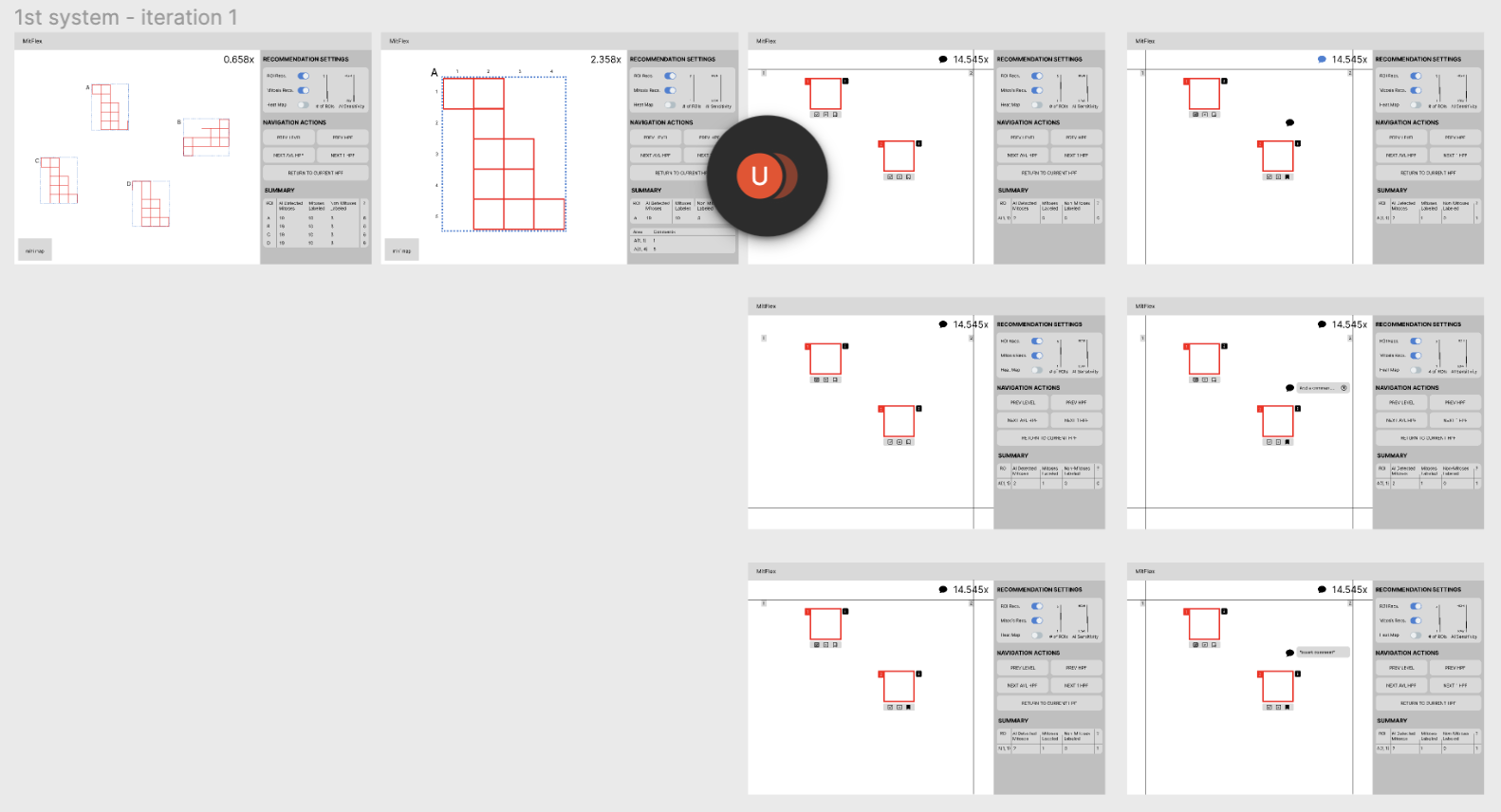
I created several iterations of my designs based on feedback from my mentor. I began with low-fidelity prototypes of the main screens of the system. High-fidelity prototypes were created afterwards.
Intuitive navigation & staying consistent
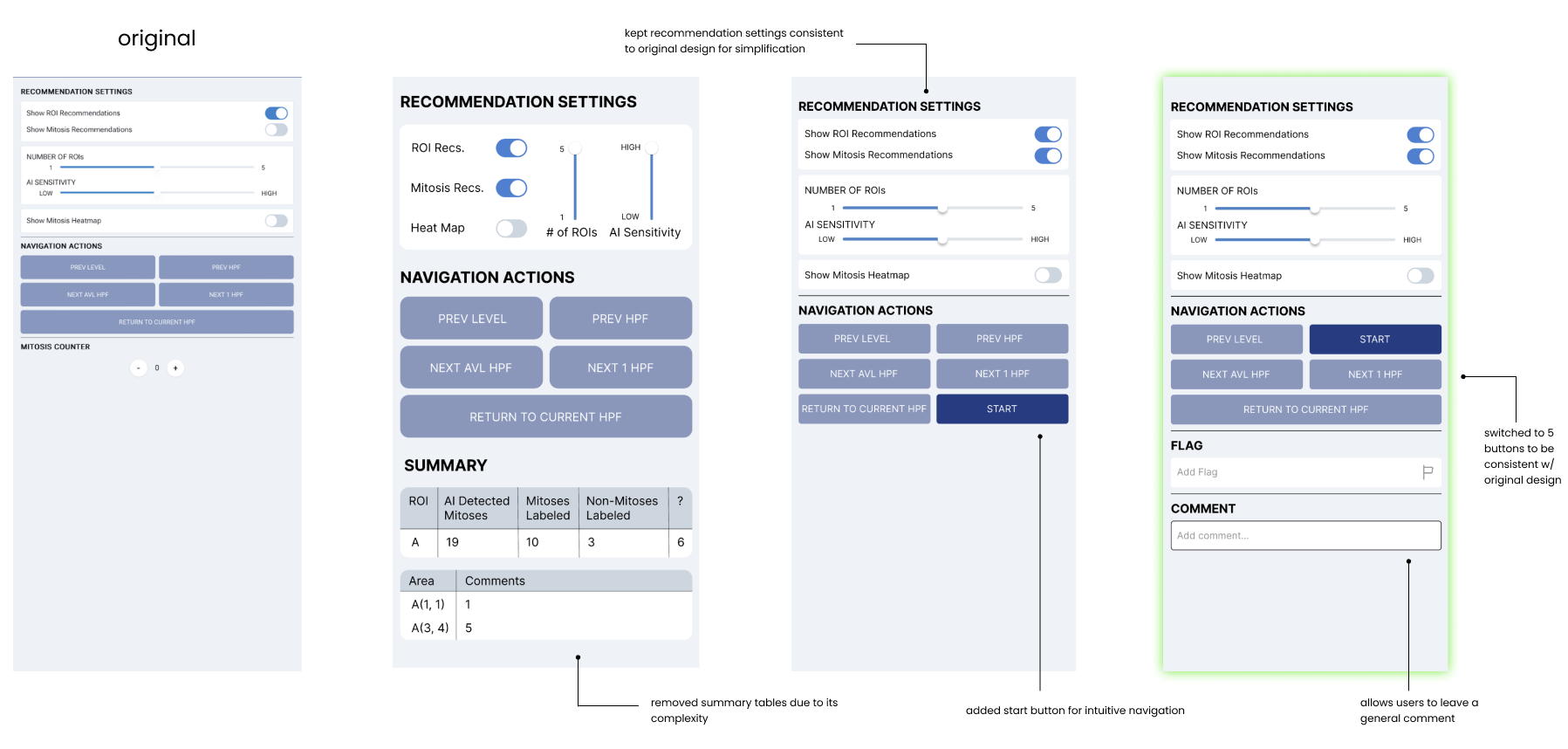
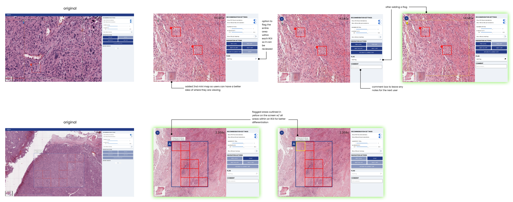
I initially added summary tables that show users the annotations made in each ROI, as well as which high-power field (HPF) that comments were left in, so that they could be quickly reviewed. However, the developers were unable to implement these ideas within the time frame, so I removed the tables and kept the design similar to that of the current system. I was then asked to make the beginning of the navigation process more intuitive. Thus, I added a “Start” button so that users can easily begin the navigation. I kept 5 total buttons under the “Navigation Actions” section in order to remain consistent with the original design and make it less complicated for developers.
Flags, comments, & mini map
Upon request, I added a comment box, so users can leave any comments and/or concerns. I also added a flag button, allowing the user to flag a specific HPF within an ROI. Flagged areas would be a yellow color, indicating to the second user that these HPFs need to be reviewed. The two mini maps on the bottom left were added to help users get a better sense of where they are viewing.
Uncertainty markings
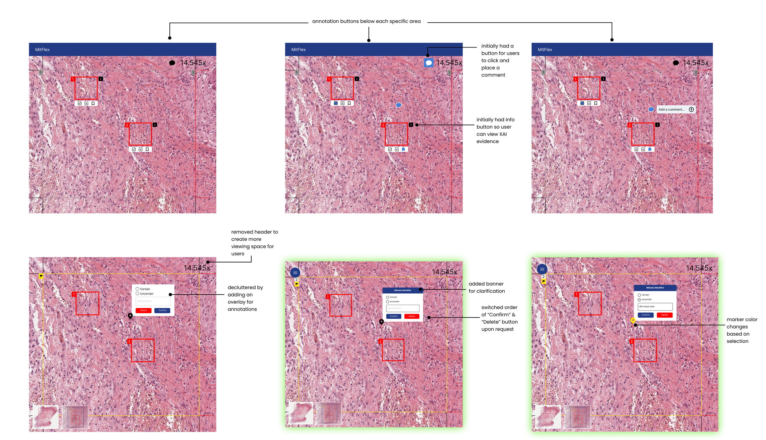
For the screen of a specific HPF within an ROI, I started off by adding a “yes,” “no,” and bookmark button under each recommended mitotic area. However, after receiving feedback from my mentor, I realized that we do not need to identify that something is NOT a mitosis, so we would not need a “no” button. I was also informed that the buttons below each area appeared too crowded, so I completely removed them.
Since I had removed the annotation buttons under each recommended mitotic area, I still needed to find a way for users to identify each mitosis. My mentor did not want many buttons cluttering the left side of the screen, so I ended up creating an overlay, which would appear after pressing the Shift key and left click on the mouse. This would allow the user to annotate by marking a mitosis that they are certain or uncertain about, and they could also leave a comment. The marker would appear green for certain mitoses and yellow for uncertain mitoses. I switched the order of the “Delete” and “Confirm” buttons upon request by my mentor. Hovering over the marker would reveal the comments.
Allowing users to save their annotations
I realized that users should be able to save their annotations and any changes made. There should also be an easy way for users to switch from the first user’s point of view (POV) to that of the second user. My mentor then mentioned that he specifically wanted users to be able to be able to go back to the previous screen, have a full-screen option, save their log, and load the previous log (the second user’s POV). I decided to add a floating action button, which provides a cleaner look, since many of the buttons are hidden under one button. I added this on the top-left corner of the screen to make it more intuitive for users, as many of these buttons would usually be found on the top-left corner of other websites or applications.
CONCLUSION
Reflection
This was my first time taking on a big ongoing research project as the sole UX designer. I was a bit nervous, but I am glad that Hongyan saw potential in me and wanted me to work with him. Working with developers on an existing system was a great opportunity, since I learned how to create designs with both developers and users in mind. I also learned that simple designs can be more impactful than complex designs, especially when working within a limited time frame.
Next Steps
For the next steps, usability testing would be conducted and iterations of the designs based on feedback from pathologists would be made. Due to the limited time frame, user testing was not able to be done within the quarter. However, once the developers have implemented the designs into the existing system, I would suggest having users complete certain tasks using the newly-designed system and interviewing the users to gain insight on their experience. Satisfaction rates could also be measured through surveys.
