Re-designing the MyUCLA Experience
As a UCLA student, I am on the MyUCLA website often and believe that it can be improved. For my personal project, I decided to give myself 48 hours to re-design the website.
Timeline
Oct 2023 (48 hours)
My Role
UI/UX Designer
Tools & Methods
Figma, UI/UX Design
PROBLEM
The MyUCLA website appears busy and focuses on items that users do not frequently navigate towards.
USER RESEARCH
UCLA students often use MyUCLA and prefer a more noticeable sign-in area.
I asked MyUCLA users, who happen to be current UCLA students, how they feel about the MyUCLA website and to describe their experience using the browser.
Based on their answers, I was able to conclude the following:
Sign-In
Users mostly navigate towards: the sign-in button or one of the header tabs
Events/Headlines
Most users never read the events or headlines
Too wordy and irrelevant to them
Infographics
Sometimes users pay attention to the banners/infographics shown
Inform them about events in an eye-catching way, but they don’t care for the info much
IDEATION
I proposed a few solutions.
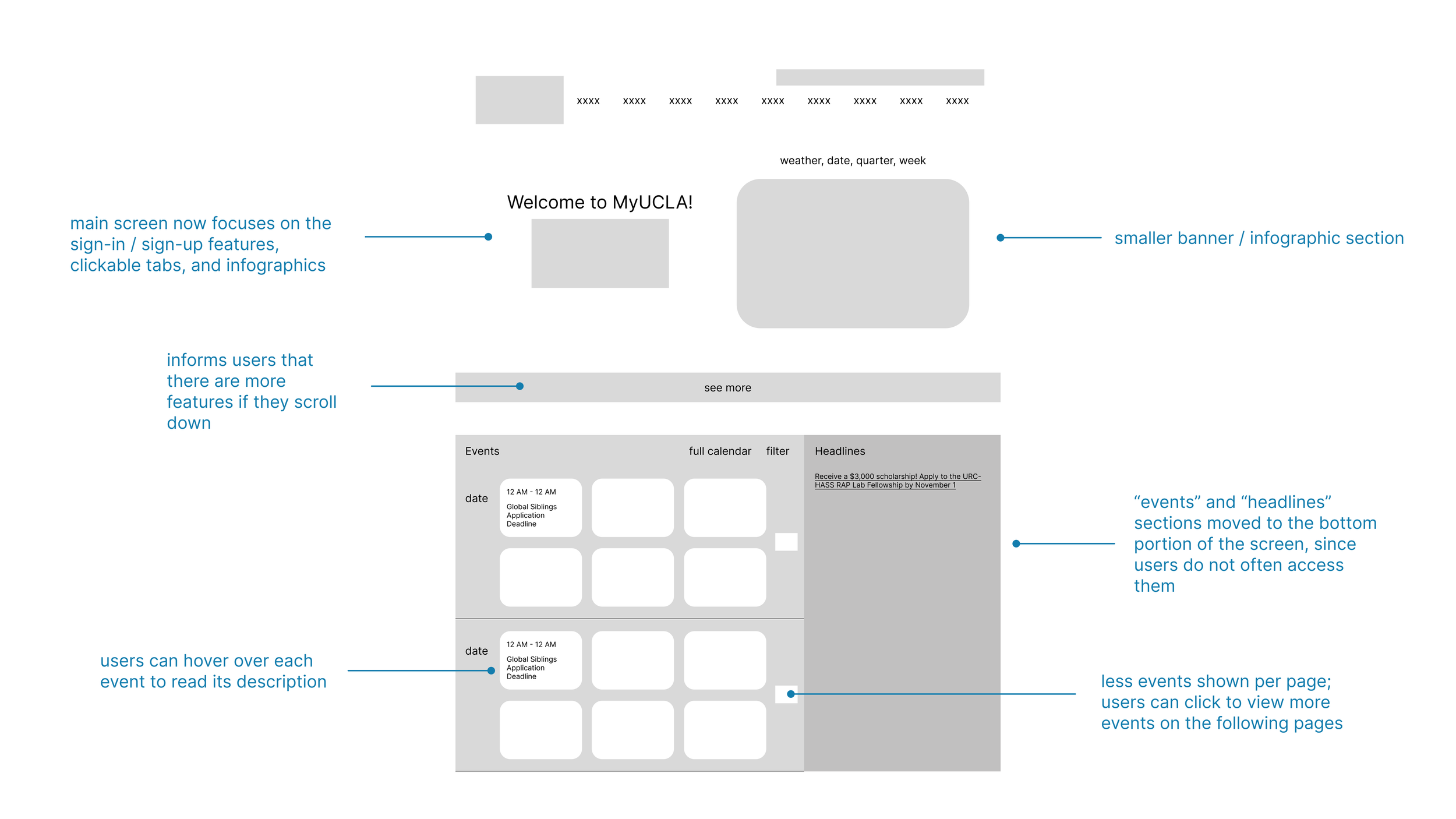
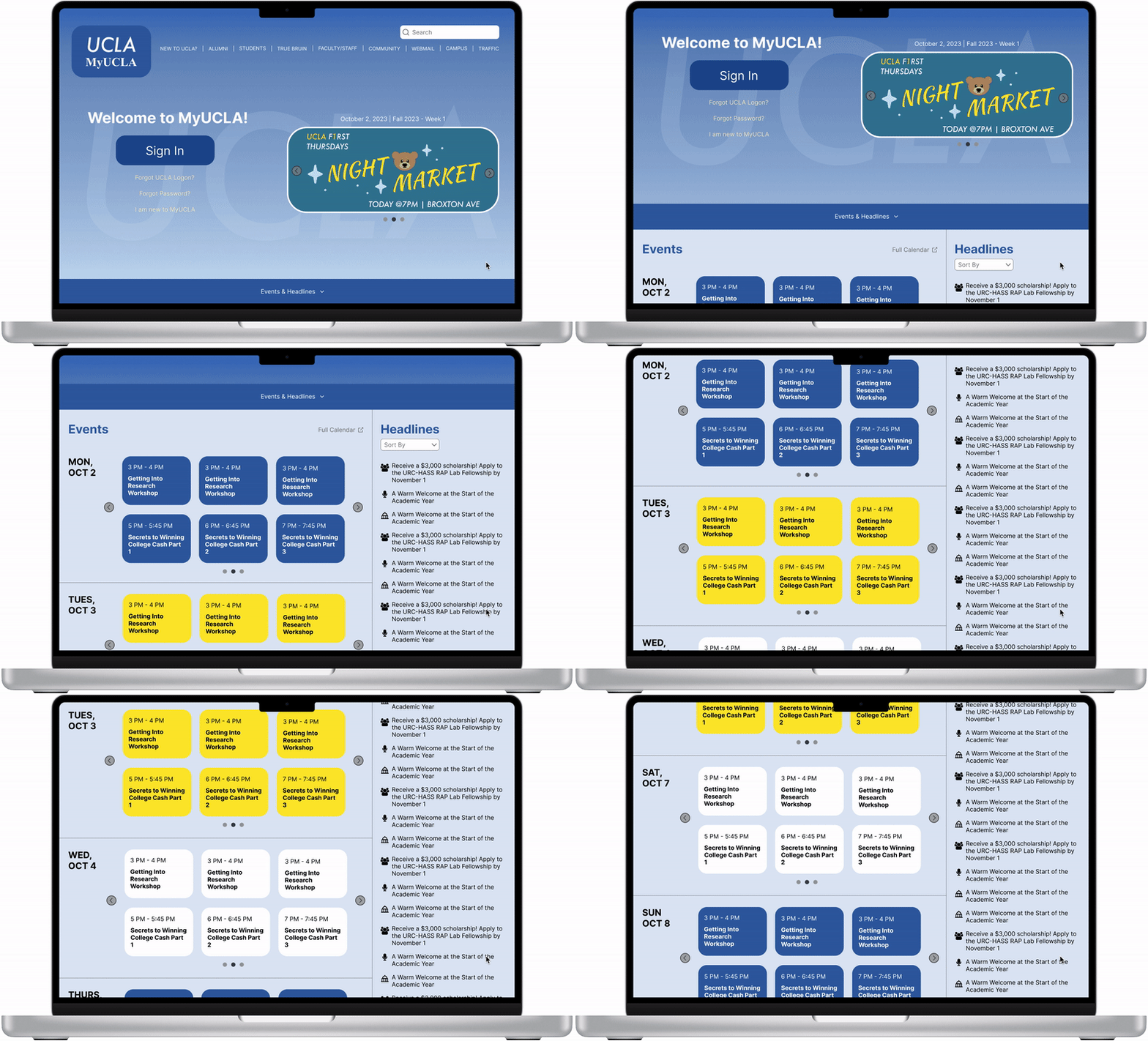
Make sign-in button bigger so that it is more noticeable and easier to access.
Make events section eye-catching and less wordy, without taking away the attention from sign-in area.
Move headlines section down since people don’t really read them.
Make the banner/infographics section smaller so that it takes up less space on the screen.


