Providing a Brighter Side of Social Media for Children with Chronic Illness
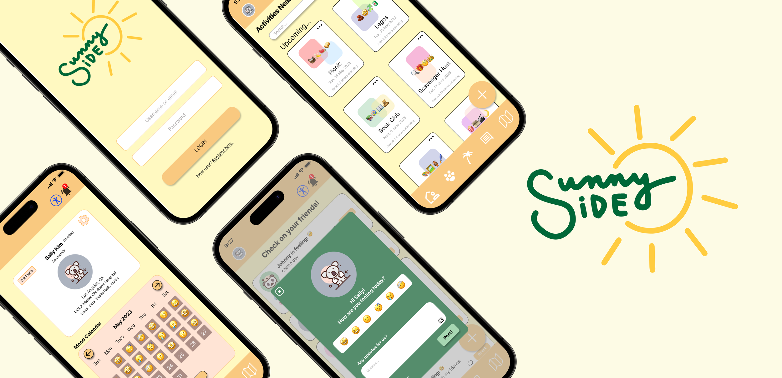
SunnySide is mobile app that allows frequently hospitalized adolescents and teens with chronic illness to connect and engage in activities with similar individuals and find community within a safe space. This was created during Spring 2023 as a project for Innovate@UCLA’s Young Tech Professionals (YTP) Project-based Bootcamp for Social Impact course (ENGR 170).
Timeline
Apr 2023 - Jun 2023 (9 weeks)
My Role
UI/UX Designer
My Contributions
Designed logo using Procreate and converted it to a vector using Adobe Illustrator
Created survey on Google Forms
Conducted user interviews, market research, and a competitive analysis
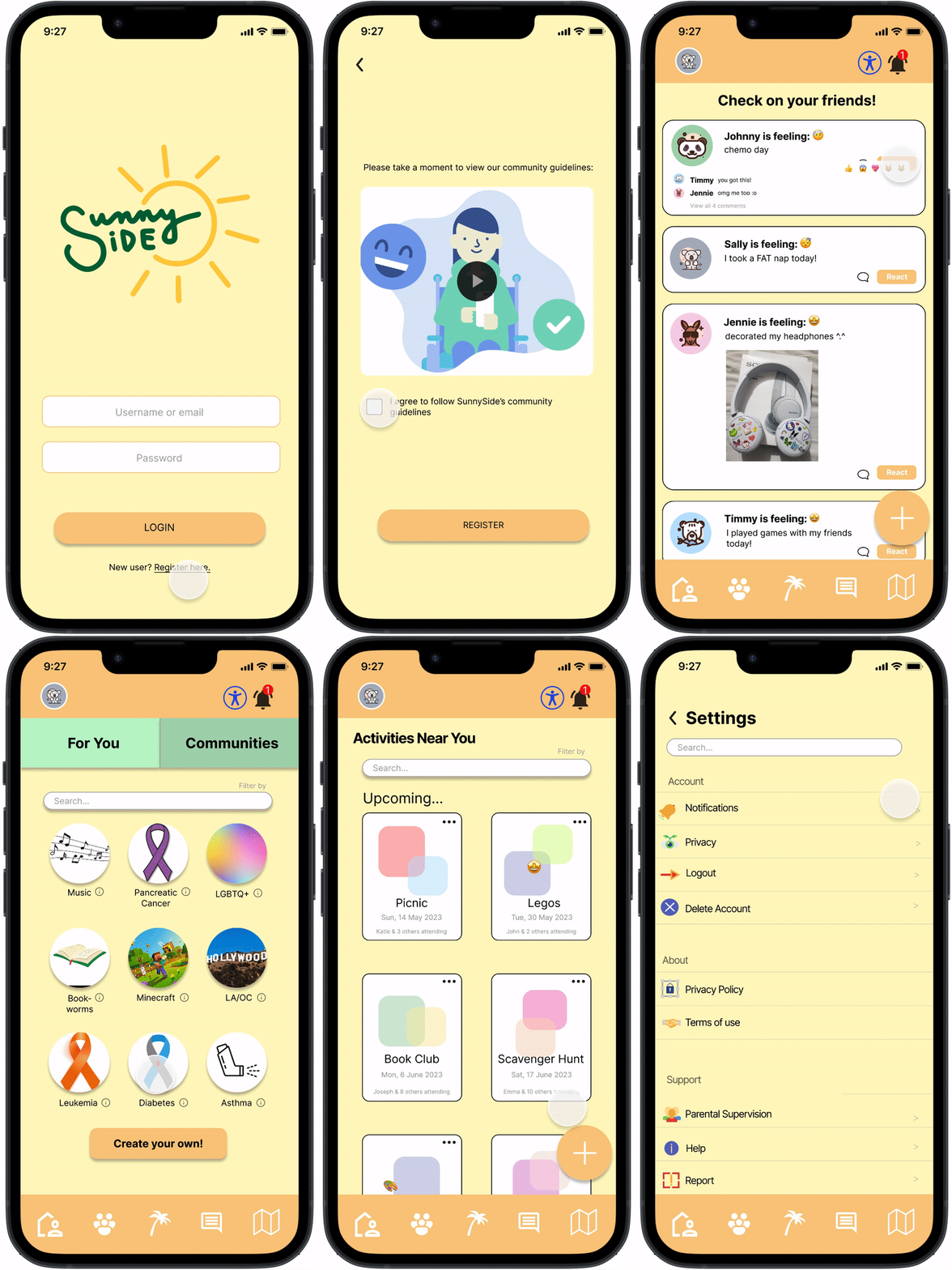
Worked on registration page, mood tracker pop-up, profile page, friends’ mood feed, For You page, and community page
Prototyped product using Figma
Team
1 Product Manager, 1 Project Manager, 2 UI/UX Designers, 1 Content Writer, 2 Developers
Tools & Methods
Figma, Miro, Procreate, Adobe Illustrator, Google Suite, User Research, UX Design, Prototyping, Agile Methodology
PROBLEM
Adolescents and teenagers with chronic illness constantly face isolation.
They often encounter ableism on the internet and have difficulty finding “like” peers, which results in poor mental health and socialization, especially during their teenage years when they should be gaining autonomy.
SOLUTION OVERVIEW
Specially curated social media platform
SunnySide combines the best features of mainstream social media, such as Instagram, Reddit, and BeReal, with an added focus on mental health. It provides adolescents and teens with a safe space where they can connect with one another to find community.
Mental health priority
Share mood emojis and realistic updates with their friends
Incorporates a mood tracker
Events
Connect virtually by hosting or joining events (ex: online games)
Attend nearby in-person events
Finding community
Join group pages based on conditions, interests, etc.
Create posts and connect with similar individuals
Exclusivity
Aims to be exclusive to those between 12-18 who are frequently hospitalized due to having chronic illness
Promotes a welcoming and safe space
LITERATURE REVIEW
Chronic illness affecting child development and well-being
To understand how chronic health conditions affect children as they get older, we conducted literature searches and found that a child being diagnosed at a young age and staying sick into their teens can disrupt normal emotional growth. They may miss out on the normal behavioral development that teens experience due to lack of independence. Constantly missing school due to hospital visitations or having activity restrictions often result in the feeling of isolation. As a result, they may feel left out or self-conscious, which can lead to behavioral issues, anxiety, and depression.
Mental Health in Kids with Chronic Illness by Juliann Garey
NAVIGATING
Addressing concerns on privacy, safety, and stickiness
As we learned more about the feeling of isolation that is prevalent within the community of frequently hospitalized adolescents and teens, especially due to chronic illness, we wanted to create a safe platform that connects these individuals together.
Long-term Goal: To be the main resource hub for adolescents and teens with chronic illnesses when they want to find community.
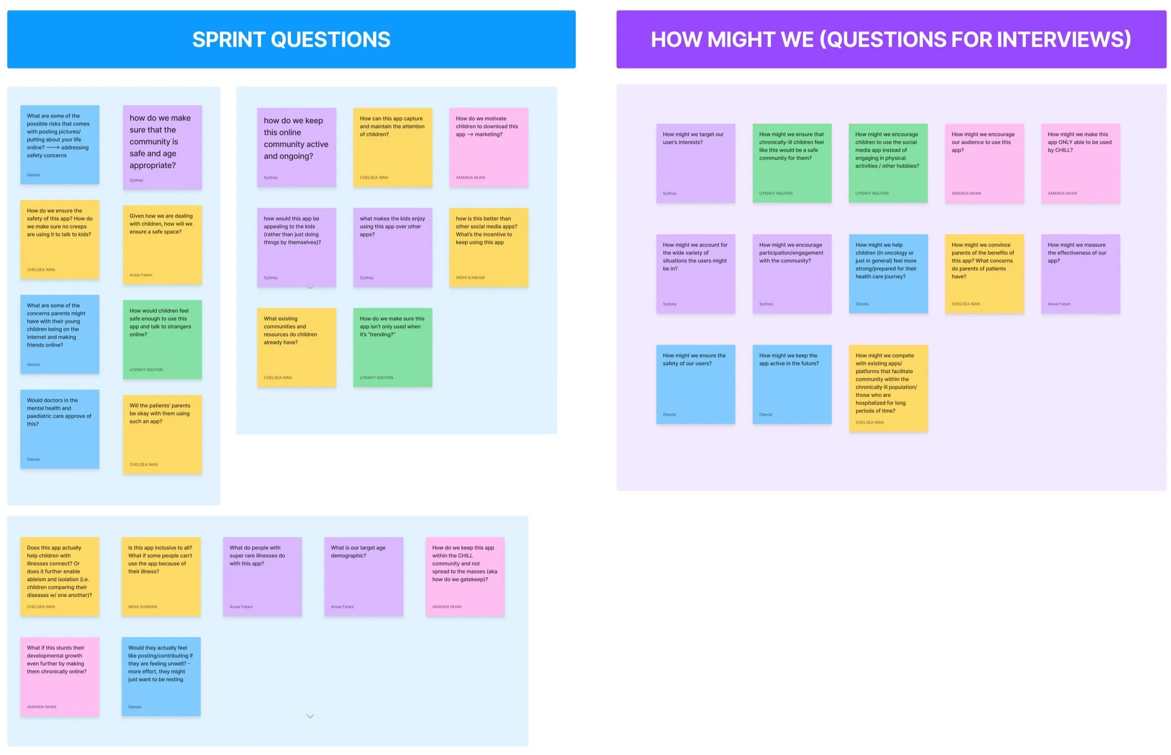
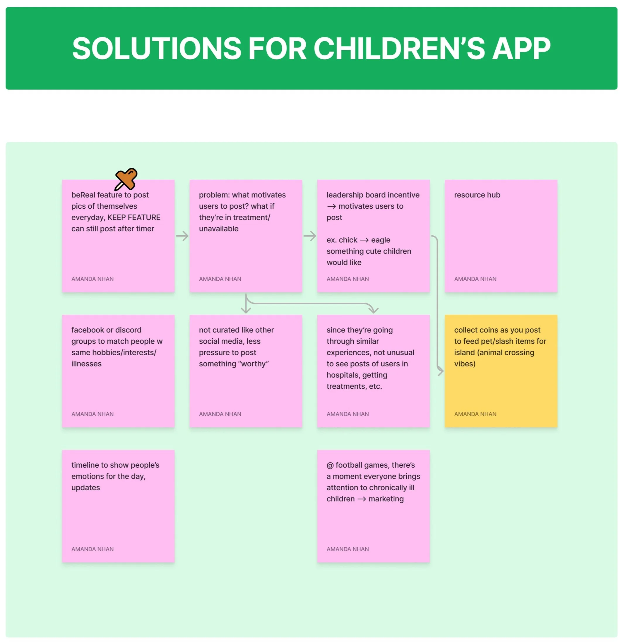
We first listed out sprint questions to give us an idea of what we need to address and account for as we move forward with our product idea. Then, we came up with How Might We (HMW) statements to organize our priorities and concerns. We used our HMWs to help us come up with questions to ask in the interviews during our research phase. Additionally, we brainstormed a couple of solution ideas and showed how they would address some of the concerns that we came up with earlier. Our main solution idea is to create a specialized social media platform for our younger audience.
CUSTOMER JOURNEY
Visualizing end users and final objective
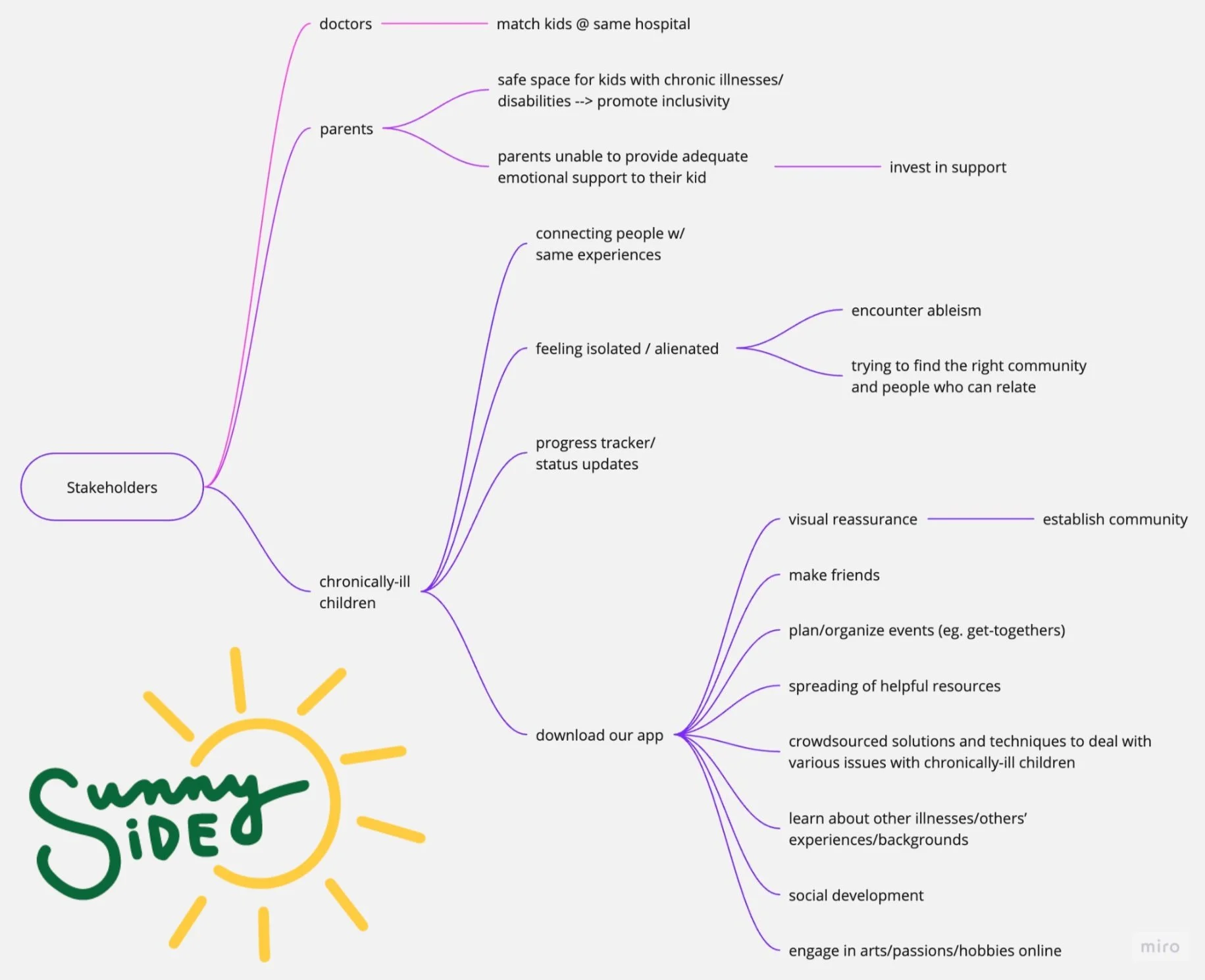
In order to better visualize who our end users were and how SunnySide would be beneficial to them, we created a customer journey map. Our initial target audience was the community of children with chronic illnesses, but we figured that it was better to target frequently hospitalized adolescents and teens (who most likely have chronic illnesses), so that we would not have to limit our app to those within a specific list of illnesses. In the end, the final objective is for them to be able to establish community.
COMPETITION
Our competitors easily create toxic & unsafe environments for younger users and lack a mental health focus.
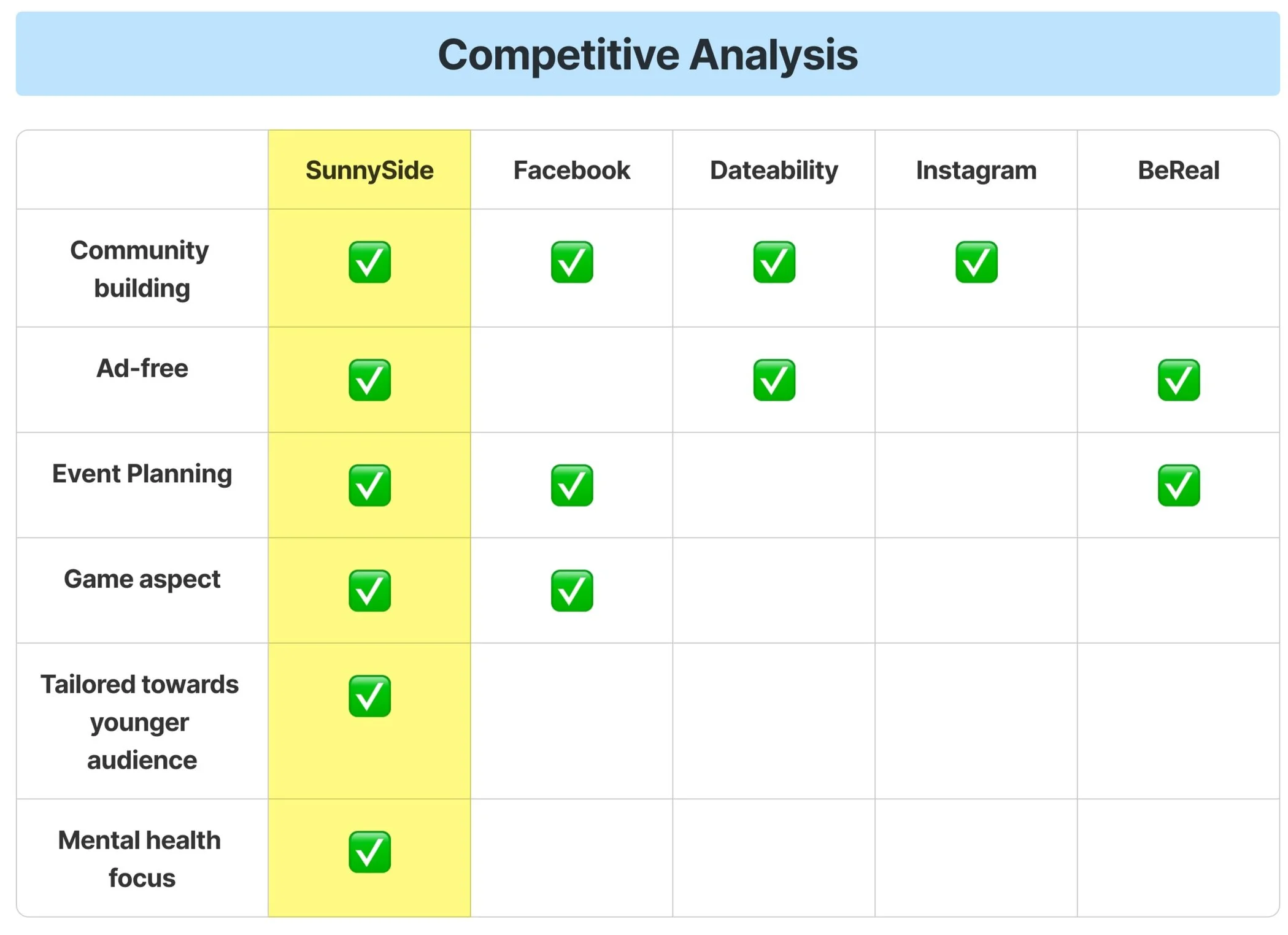
Since our product idea is so niche and targets a specific demographic of adolescents and teens, we were unable to find anything like it during our research. However, we were able to identify a couple of competitors that have similar or aligning features with our product. We did a competitive analysis and created a perceptual map of social media.
We found that many mainstream social media platforms contain curated content and are used by the general public, not a specific community. There were a few applications that also target communities with disabilities, such as Dateability, but these apps target the adult demographic, neglecting adolescents and teens.
USER SURVEYS
Our users spend many hours on social media.
To gain insight on our users’ social media usage, we sent out a quantitative survey and received 14 responses from users who happen to be on the upper region of our target age range.
of users have a chronic illness
92.9%
of users spend 4+ hours on social media each day
69.2%
Getting to know our users more
Most of our users preferred texting and using social media apps, like Instagram and Discord, as a form of communication instead of calling. Thus, we prioritized a messaging feature as opposed to a video or audio calling feature.
Our survey results also showed that our users…
Dedicate most of their day towards dealing with their condition
Are very likely to look up information on their condition
Feel comfortable talking to people they know about their condition
INTERVIEWS
Experts mentioned that young patients with chronic illness silently struggle with mental health, lack social interaction, and lack access to age-appropriate activities and entertainment.
To validate our problem statement and better understand our users on the lower region of our target age range, we interviewed experts who were very familiar with or worked closely with children who have chronic illnesses. Ideally, we would prefer to visit hospitals and directly interview these children, but we were unable to do so due to safety reasons and time constraints.
We conducted 4 interviews with:
Pediatric oncologist
Co-founder (who also grew up having a chronic illness) of dating app for people with disabilities
Coordinator of the Pediatric Advanced Practice Program
Professor at UCLA School of Nursing
We obtained valuable qualitative information on our users and their environment, which allowed us to understand their needs and how to ensure their safety.
THEMES + INSIGHTS
Major insights…
Theme 1: Mental health
Children with chronic illness have very poor mental health due to discrimination, online toxicity, their physical state, etc.
Mental health resources are insufficient & hospitals are often too busy to check on patients’ mental state
Adolescent patients are not always expressive of emotions
Theme 2: Community
It is unlikely that adolescents and teens know many people with similar experiences or conditions as them that they can reach out to
Younger patients are often surrounded by adults and healthcare workers, rather than peers, causing them to feel isolated
Theme 3: Autonomy
Younger patients lose a sense of independence when parents have to take care of them
It is challenging for patients to gain autonomy with their interests, since they are not exposed to age-appropriate resources
USER PERSONAS
Identifying pain points
Based on our quantitative and qualitative research, we created user personas in order to identify our users’ pain points and allow us to better empathize with them.
IDEATION
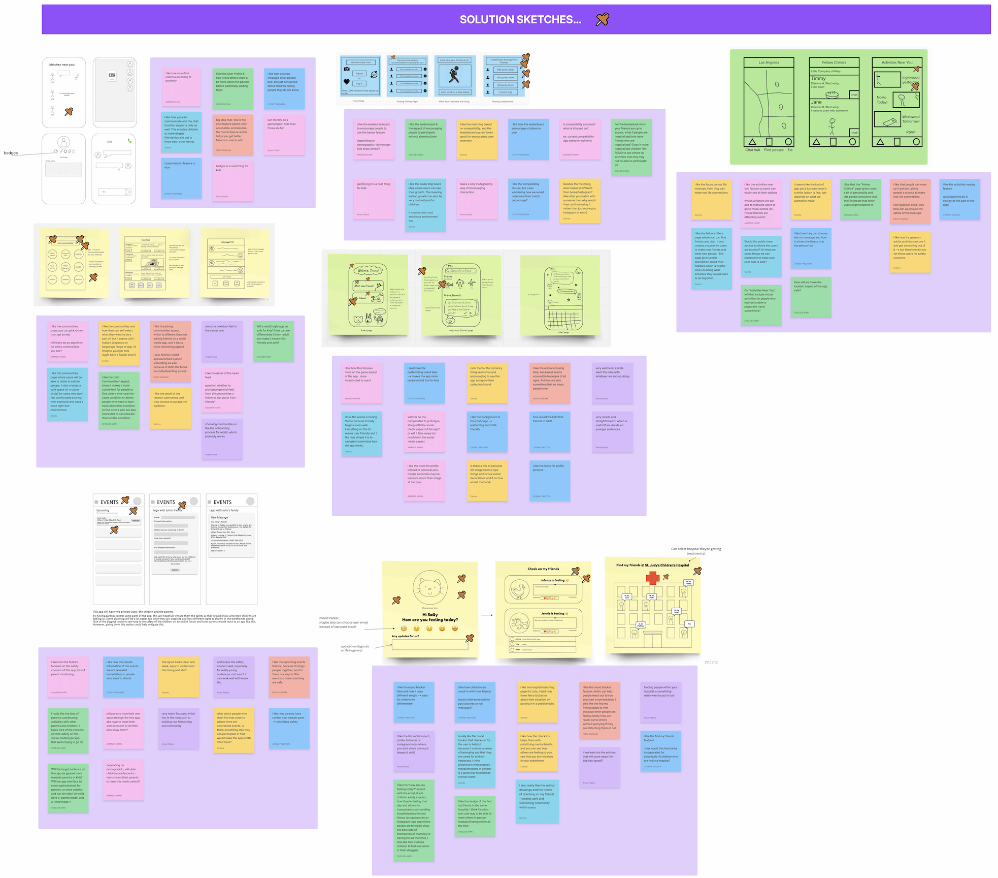
We started off making individual Crazy 8s, which consists of 8 variations of our strongest ideas that we sketched in 8 minutes. Using our Crazy 8s, we expanded on our ideas and created solution sketches, consisting of detailed wireframes. We brought our solution sketches together, pitched our ideas, and left critiques, comments, and questions. Using the dot voting technique, we selected our top features to implement. Due to time constraints, we had to add some features into our backlog.
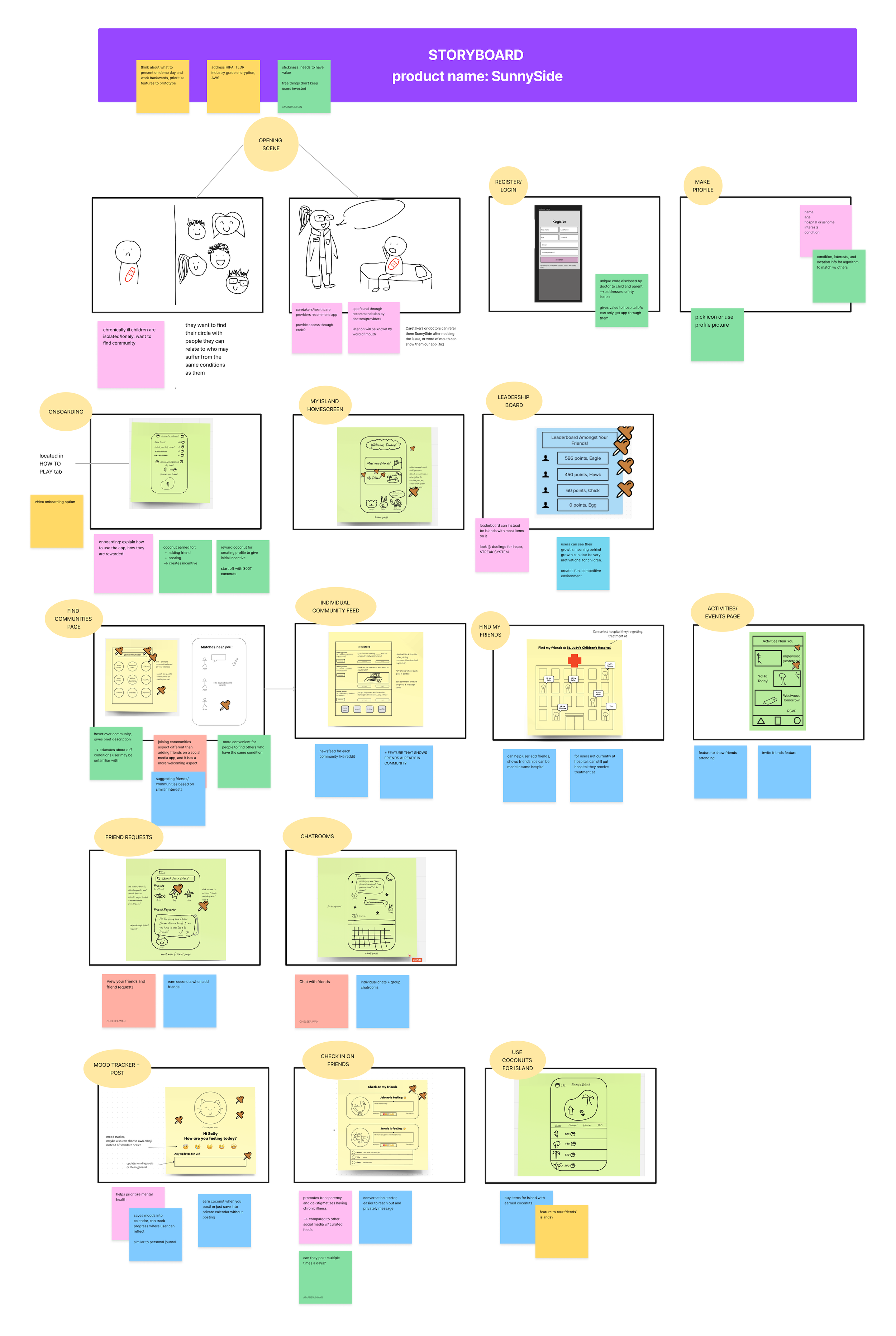
We then formed our storyboard by arranging our sketches in a way that tells a cohesive narrative of our product. This allowed us to imagine the prototype and spot problems before building it.
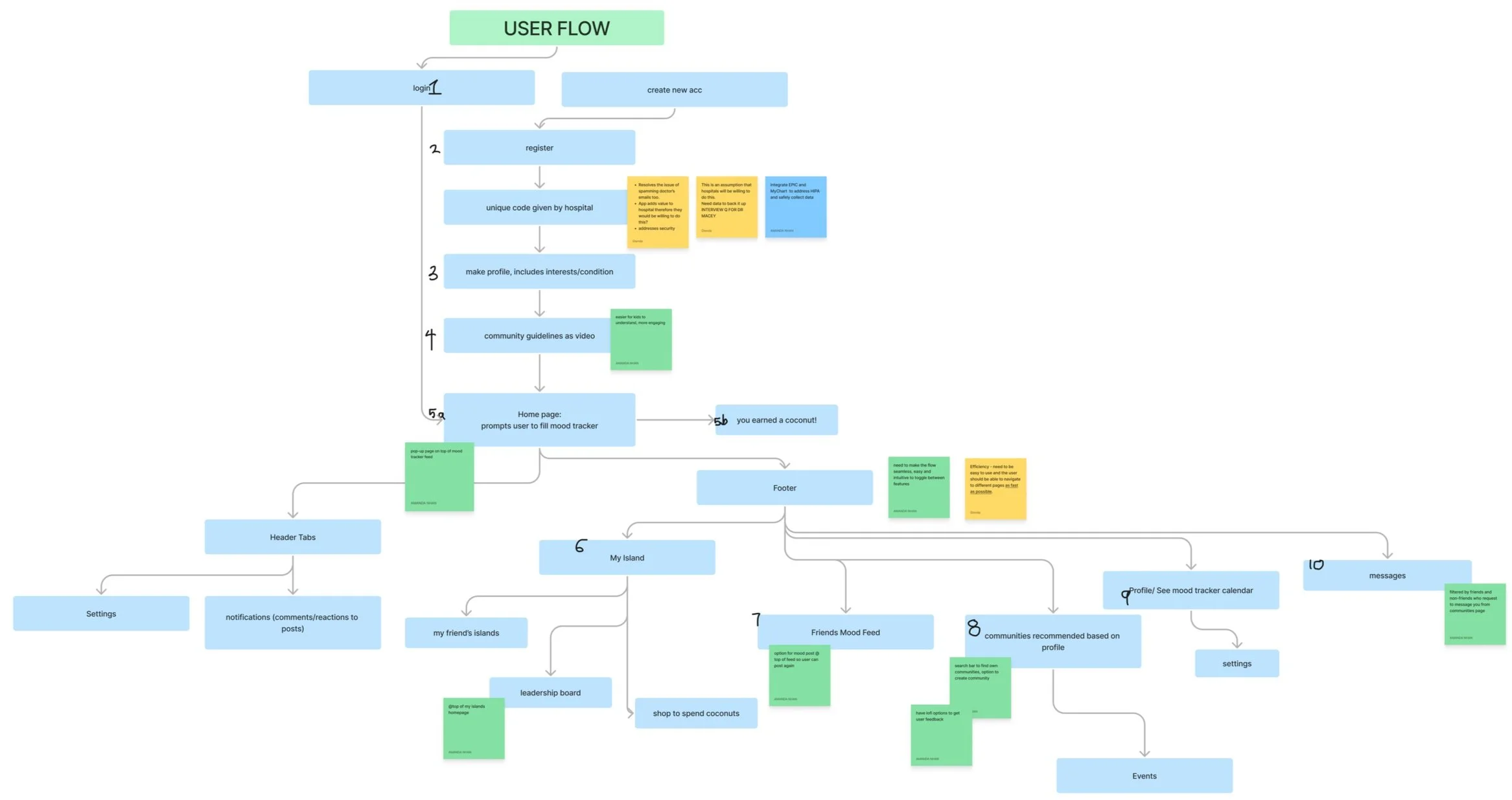
Our user flow was created to help us visualize the screens and the steps that the user would take when navigating through the app. We wanted to make sure that SunnySide was efficient and intuitive, allowing the user to reach their destination as quickly as possible.
Story behind the design
DESIGN
Making improvements in designs
We constructed wireframes and reiterated our designs based on feedback from our cohort, instructors, and industry experts. We were unable to conduct usability testing, so we used survey and interview responses to help us design features that would be best for our users.
Safety and clutter on community feed
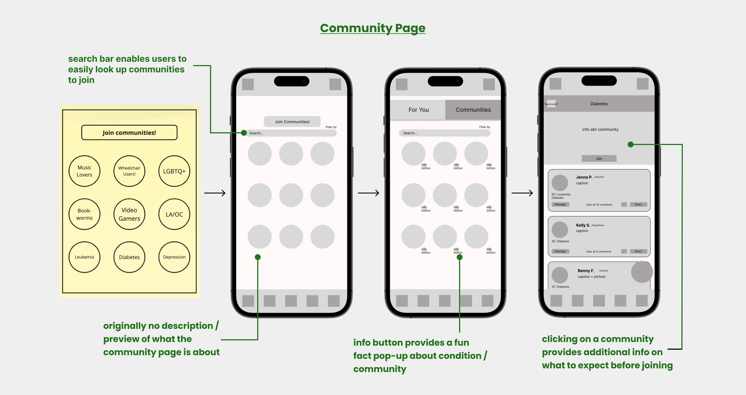
Based on user responses, users value online friendships, but prioritize their safety. We changed anonymous usernames to actual names to create a sense of familiarity and make online friendships feel more real, as well as allow for easier user identification if safety issues arise.
Opportunity to learn about various conditions
Based on feedback from industry experts, it would be beneficial for users to learn about other conditions in order to spread awareness and potentially reduce unintentional ableism. We implemented an info button beneath each community icon to provide users with fun facts about the condition or community’s interest.
Familiar faces at events
Based on user responses, a sense of familiarity is very important. Users tend to feel comfortable opening up about their condition to people they know. Thus, we added a feature that allows users to see which of their friends are attending an event, in hopes of encouraging users to attend and meet new people similar to them.
FINAL PRODUCT
5 main features of SunnySide
Platform that values exclusivity and safety
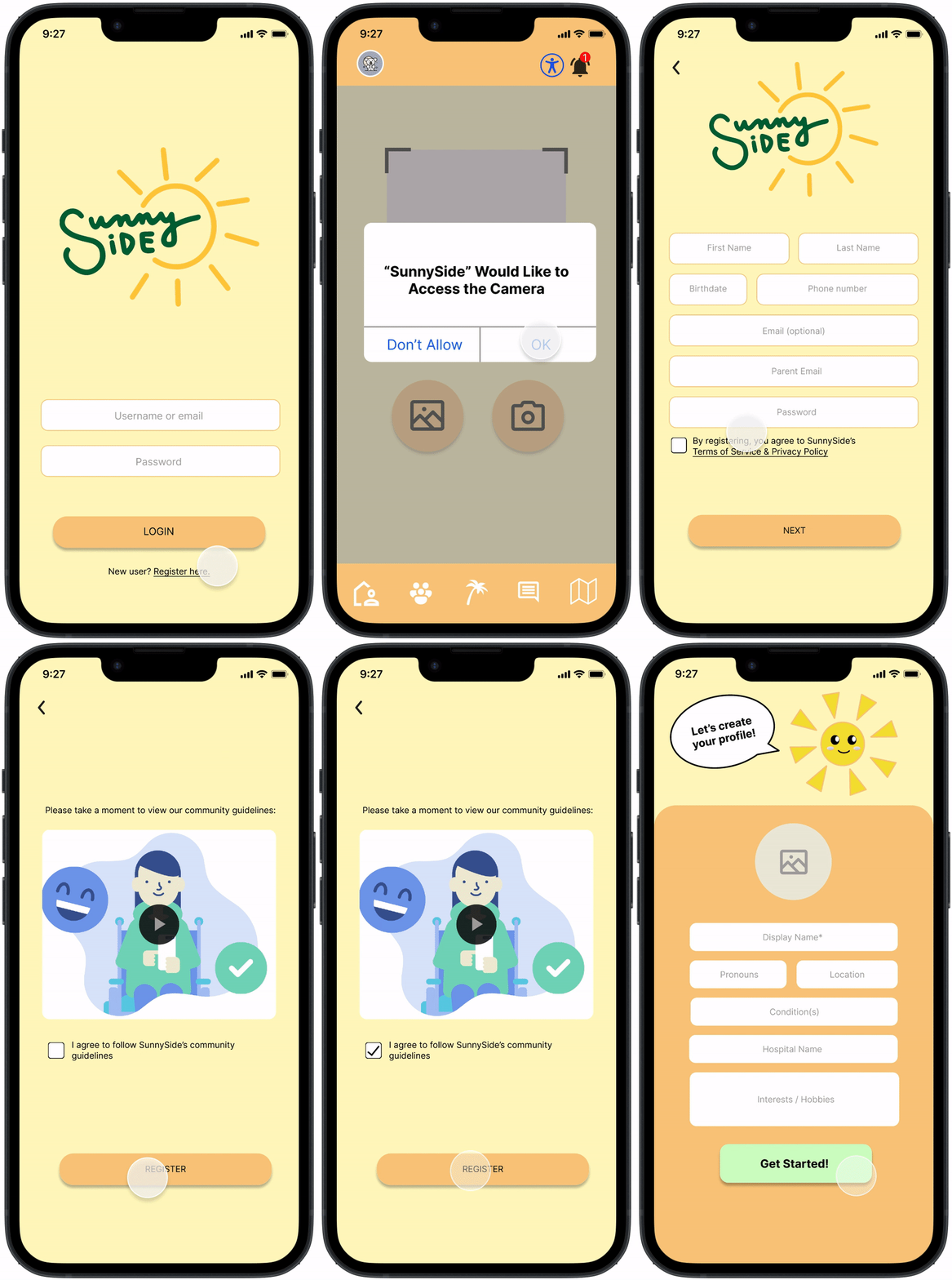
Gaining access to the app requires QR code from social workers, nurses, or other healthcare professionals
QR code is specific to each hospital & re-generated monthly
Requires parent email verification & completion of community guidelines video
Mood check-ins and tracking
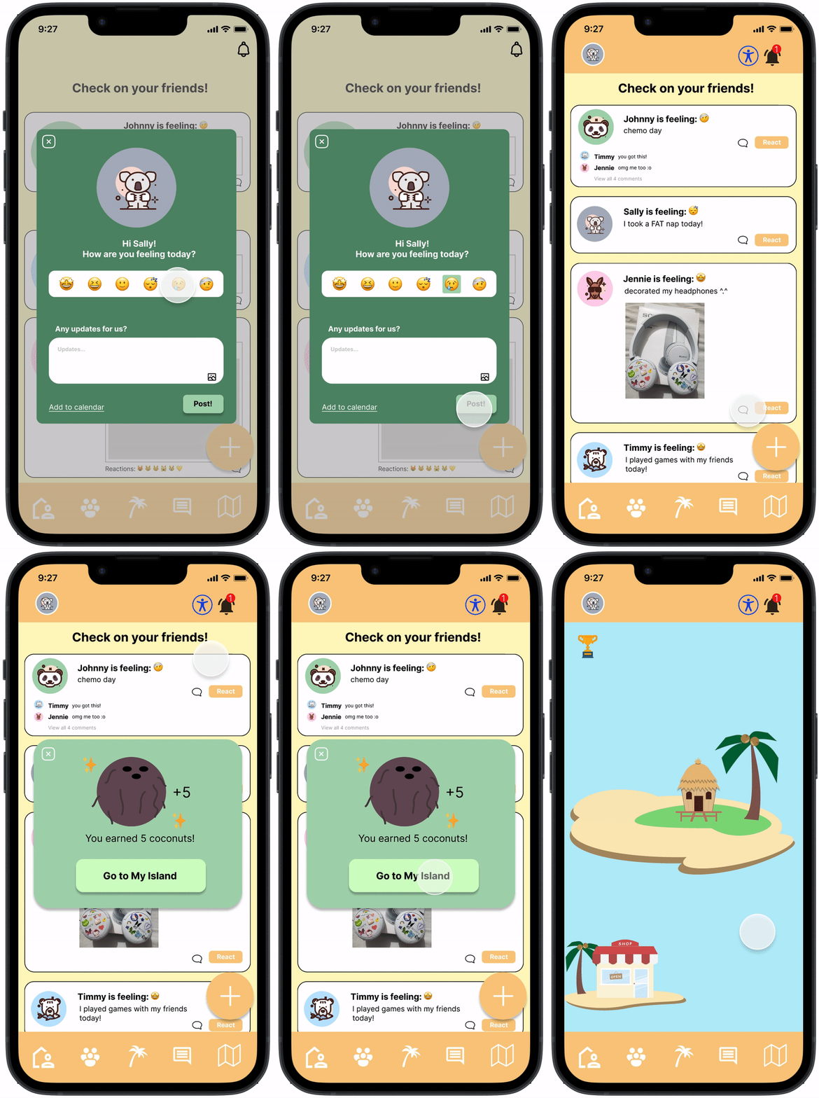
Daily pop-up that allows users to share their mood and updates with friends
Can also add their mood to their calendar for personal tracking
React to posts to show support
Island customization
Earn “coconuts” (which acts as a form of currency) for each post
Coconuts can be used to purchase customizations for users’ “island,” which helps them move up the leaderboard
Acts as an incentive for users to continue using the app
Connect via communities
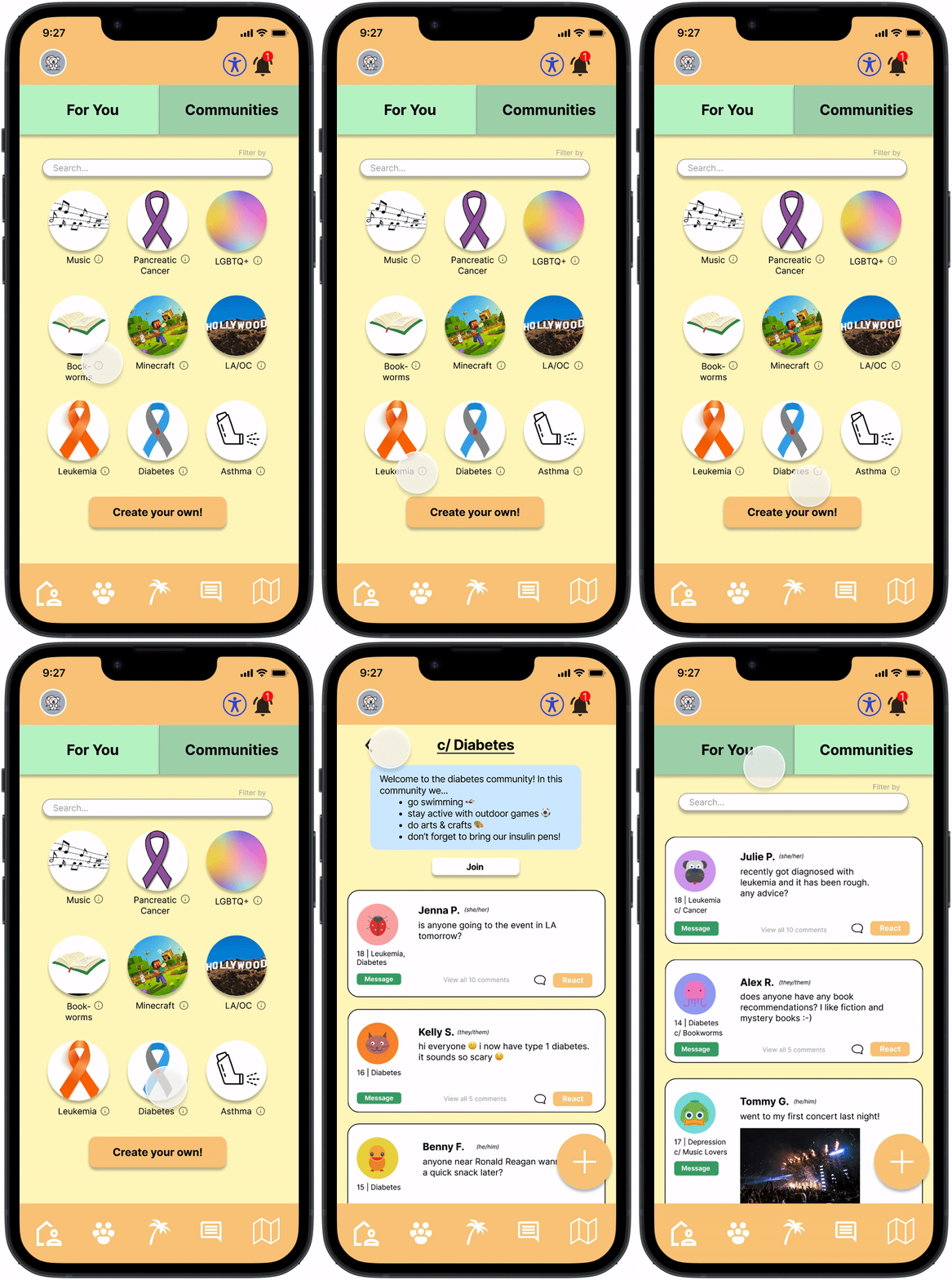
Create new or join existing group pages to connect with individuals of similar interests or experiences
Post and interact in specific communities
Learn about other conditions
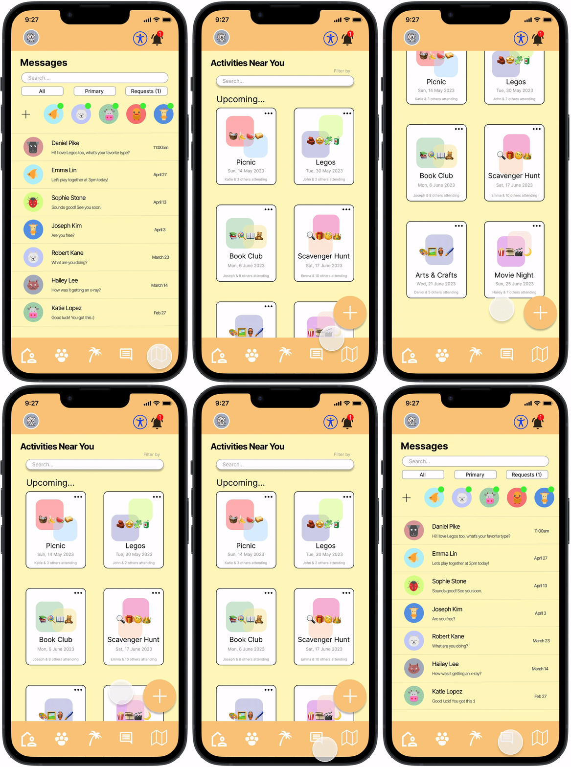
Make friends online and in-person at events
Message other children to connect or learn more about their condition/experiences
Host or attend events (ex: online movie night, picnic, etc.)
Parents would be notified of child’s attendance at events for safety reasons
CONCLUSION
Reflection
This was my very first project, and as someone who grew up having a chronic illness, this project means a lot to me and has allowed me to strongly empathize with our users. I am so glad that I pushed myself out of my comfort zone and enrolled in ENGR 170 despite of having no prior product design experience. I am grateful to have worked with an amazing team (Bear Care) and received guidance from my instructors and mentors. We presented SunnySide to a panel of industry professionals and received 2nd place for overall best product and pitch!
Key Takeaways
Take advantage of your resources. It is okay to ask for help. We were able to find strong interviewees once we expressed our request for assistance and reached out to our mentors and instructors, who were surprisingly connected to many healthcare professionals.
Prioritize the user. Working with a creative team allows new ideas to be constantly created. However, it is important to identify the features that would solve the user’s problems from the ones that would just be fun to have and are not high on the priority list. We had to add many of our unimplemented ideas into our backlog.
Feedback is valuable. Due to time constraints, we were unable to gather feedback through user testing. However, we received feedback from our cohort, instructors, and industry experts, which helped us perform product and design iterations. In the future, I hope to be able to conduct user testing and create more design iterations based on direct user feedback.
